Want to know how to learn photography on your own online? Here I will teach you the basic understanding of how photography works and the fundamentals you need to start shooting like a pro no matter what you want to shoot.
Read moreBest Photography Books Beginners
There is no shortage of ways to learn photography. From Photography tutorials on Youtube, Photography Podcasts, and Photography courses and workshops it is easy to forget about the golden standard and the way many beginners learned photography for a century before the internet, BOOKS!
It may seem weird learning photography from books which are traditionally full of text but the truth is books cost a lot of money to produce and therefore the content in them is much higher quality than the majority of free resources. I can tell you first hand these are the best photography books for beginners and if you are serious about learning photography these books will guide you wherever you want your camera to take you.
This article contains affiliate links to the books listed and if you purchase one of the photography books below I may receive a small commission but this has in no way influenced my real world experience using each and every book listed below.
1: Understanding Exposure by Bryan Peterson
Veteran photographer Bryan Peterson explains the fundamentals of light, aperture, and shutter speed and how they interact with and influence one another. With an emphasis on finding the right exposure even in tricky situations, Understanding Exposure shows you how to get (or lose) sharpness and contrast in images, freeze action, and take the best meter readings, while also exploring filters, flash, and light.
2: Authentic Portraits by Chris Orwig
Taking a portrait is not an easy task. In fact its an art form of its own and Chris Orwig has mastered this art and shares his wealth of knowledge with you. The techniques are refreshingly simple and quickly build confidence. From finding subjects to preparing your own self and how to encourage your subject, this book filled with more than 400 pages of portrait photography tips and education has it all. If you want to take soulful photos full of meaning and not just snapshots, this is the book for you.
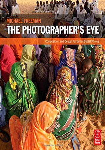
3: The Photographers Eye by Michael Freeman
Design is the single most important factor in creating a successful photograph. The ability to see the potential for a strong picture and then organize the graphic elements into an effective, compelling composition has always been one of the key skills in making photographs.
In this book, Photographer Michael Freeman teaches how digital photography has brought a new, exciting aspect to design with instant feedback from a digital camera allows immediate appraisal and improvement. This has had a profound effect on the way digital photographers take pictures.
4: Advancing your Photography by Marc Silber
Marc Silber has not only been a guest on the Beginner Photography Podcast but has interviewed some of the world's best photographers and learned their secrets for stunning composition. Now he passes their wisdom along to you in an easy to understand handbook. Too many photographers get to a certain level and find it hard to advance. We're bombarded with so many videos, books and people telling you what to do it can be overwhelming. Marc wrote Advancing Your Photography so you could have one easy to read handbook to carry with you. All his tips are based on decades of photography and the deep wisdom of the fantastic photographers he's interviewed.
5: Good Pictures by Kim Beil
When I attended film school, our education was broken up into two main themes. Technical and theoretical.
The technical was obvious and anyone could learn it quite easily.
The theoretical is what fascinated me.
After graduating I transitioned into photography. All the technicals remained the same as cinematography but I always felt I was missing the theoretical lessons of photography and what happened in the past to get us to where we are today.
Good Pictures by Kim Beil provides a fascinating look at how we got to where we are today in photography and why we use the tools we do.
Before reading the book I had never given the question of why do we have vignettes and where did they come from, a single thought. I feel much more connected to photography after reading Good Pictures. Highly recommended.
6: Picture Perfect Practice by Roberto Valenzuela
If you’ve been frustrated and overwhelmed by the challenges of real-world locations and executing a great image–or if you simply want to become a better shooter but don’t know where to start– Roberto Valenzuela’s Picture Perfect Practice gives you the tools and information you need to finally become the kind of photographer you’ve always wanted to be: the kind who can confidently walk into any location, under any lighting condition, with any subject, and know that you can create astonishing photographs that have a timeless impact.
7: The Photographers Guide to Posing by Lindsay Adler
When photographing people, you can have a great composition, perfect light, and the right camera settings, but if your subject doesn’t look right―if the pose is off―the shot will not be a keeper. Posing is truly a crucial skill that photographers need to have in order to create great photographs. If you’re looking to improve your ability to pose your subjects―whether they’re men, women, couples, or groups―best-selling author and photographer Lindsay Adler’s The Photographer’s Guide to Posing: Techniques to Flatter Everyone is the perfect resource for you.
8: Fast Track Photographer by Dane Sanders
Competition in the photography industry has never been fiercer. But in this empowering guide, acclaimed photographer Dane Sanders reveals that the key to success is to stop worrying about what everyone else is doing and start focusing on your most powerful resource: you.
9: How I Make Photographs by Joel Meyerowitz
With nearly 60 years of photography experience, Joel Meyerowitz knows his way around the camera and shares some of his best tips to creating compelling and beautiful images in this book, How I Make Photographs. Joel Meyerowitz has been called one of the most respected street photographers of all time and in this book he breaks down 4 key concepts that will help you to better capture your world.
How to use a camera to reclaim the streets as your own
Why you need to watch the world always with a sense of possibility
How to set your subjects at ease
The importance of being playful and of finding a lens that suits your personality.
BONUS: Magnum Contact Sheets by Kristen Lubben
This groundbreaking book presents a remarkable selection of contact sheets, revealing how the most celebrated Magnum photographers capture and edit the very best shots. Addressing key questions of photographic practice, the book illuminates the creative methods, strategies, and editing processes behind some of the world’s most iconic images. The book is a bonus because it is less actionable than others on this list and focuses more on the stories from the photographers who took the photos. This is a must read.
Check out more recent articles from the Beginner Photography Podcast
Photographing Historic Buildings
Photographing Historic Buildings
Taking on the mission of photographing historic architecture is a great way for any beginner to learn the fundamentals of photography. Seeing as you won’t need to move quickly to chase around your subjects, do yourself a favor and get a tripod. Apart from stability, tripods can give you the time and space to figure out the best settings on your camera in order to capture the best images.
Another important aspect to note for this type of photography is how to maximize depth of field, an element that can sharpen the sense of space in your photographs. For up-close to medium distance shots of historic buildings, Light Stalking advises using wide angle lenses from 12mm to 35mm so you can shoot from the widest angle of view possible. This is especially useful in cramped cities where other buildings and objects in the street will get in the way of taking shots that include your entire subject.
In relation to this, you should get used to shooting at a smaller or higher aperture and lower ISO, a technique which Tech Radar correctly recommends for maximizing depth of field. Armed with a tripod in such settings, you can freely set slower shutter speeds to get the correct amount of exposure. This particular technique is all about reducing the amount of light that hits the sensor of your camera, forcing you to use as little light as possible – and as much time as you need – to get your perfect shot. Once you get used to shooting buildings from a tripod this way, it will be easier to then experiment with different settings (and angles) as you’ll have more control of the available light.
Another good way for any budding historical architecture photographer to start is by focusing on famous historical structures. This will allow you to compare your own shots with that of famous photographers, which can ultimately provide insight on your personal style and approach to the art of photography. New York City is one place that’s filled with photo opportunities, as it has plenty of places to practice your skills. Apart from NYC’s wide range of iconic buildings, James McGrath from Yoreevo states that in 2015 there were 13,500 buildings that were over six stories within the city. This gives you ample opportunity to photograph buildings that are not famous. You can then compare how well you do with a building that you have no reference for, with a building that has photographed thousands of times. As long as you have your camera and tripod, you can turn any walk or commute through Manhattan into a crash course on architectural photography throughout the different stages of the old city’s history. It’s not uncommon for both tourists and locals to go on this type of photo walk, so the next time you’re in the Big Apple, you can even look for amateur photography groups organizing either free or local teaching tours. If you’re using a DSLR, it would also be a great way to get instant feedback from fellow amateurs and veteran photographers alike.
Finally, you should also try taking pictures of the same subjects in both sunny and nighttime conditions. This can give you a much greater sense of how light dictates the mood of any shot. While shooting in the dark can be difficult, the play of light on historic architecture after dark opens up new avenues of photographic storytelling – valuable insight for anyone who considers themselves to be students of photography. Thomas B. Wilson in his guest post here on The Beginner Photographer advises that "the best way to get a feel for this is to practice and figure out how best to handle the duel between natural darkness and man-made light.”
Want More Photography Tips to Grow Your Skills?
The Ultimate Beginner Photographers Guide to Composition
If you have ever looked at a photo and thought “wow this is a really good photo” but couldn't figure out WHY, it’s probably because the photo had a solid composition. What’s great about that is that, I’ve said this a million times, learning and practicing composition has nothing to do with how good your camera is. You can get better compositions with the cell phone in your pocket!
Composition is first step to mastering your photos. Anyone can get the technicals if they keep with photography long enough but few continue to try and see the world around them in a new way to find interesting compositions. Sometimes you have to get low, or high or jump 2 steps to the left to get the perfect frame.
The challenge with composition is that you want to be close enough to tell a compelling story. If you’re too close, your will not have enough information on what’s going on. If you’re too far away the photo will not be compelling as it will not have enough impact.
First What is composition?
Google defines composition as “the nature of something's ingredients or constituents; the way in which a whole or mixture is made up.”
Like I mentioned earlier composition can be practiced and mastered anywhere with any camera. I’m sure at some point in your life you have looked at an iPhone photo and thought that it was better than anything you have created with your DSLR camera. The answer is composition.
Are you getting the bigger picture here?
A great photo is not all about having a wide aperture or telephoto lens or newest camera body that lets you shoot at 14 frames per second.
So let’s break down composition. In photography I look for three things to make a strong composition. The Rule of Thirds, Framing, and Leading Lines. Adding any of these elements into your photos will make them more compelling to look at.
1: The Rule of Thirds
The Rule of Thirds is perhaps the most well known compositional tool. Its built into every modern cell phone. Think of an imaginary Tic Tac Toe board laid on top of a photo. Science has found that where the vertical and horizontal lines intersect is where your eyes naturally find pleasing. So placing your subject within the intersecting points will make your photo more enjoyable to look at.
Beginner
Within but like most things, it’s simple to start and difficult to master. Starting with the rule of thirds you can simply just angle your camera to the left or right to put your subject in the intersecting line. As you can see in my example below, I went to take a photo of my son Charlie and just angled the camera more to the left to place him in the right third of the frame. Simple.
In my next example, I did the same thing with my daughter eating some fruit. I angle the camera down so her face would be in the top left third and her hand reaching for the plate was in the bottom right third. Easy Peasy.
Intermediate
Already your photos are starting to look better but you want to take it further. This is when you start to add more context to your photos, Whats going on, where are you, etc. The first photo you see our son has no cavities (woohoo!). So I placed him in the lower left third, but to add more context I wanted to include the dentists' sign. I took a step back and brought the sign to the top right of the frame. Now we have more of the story!
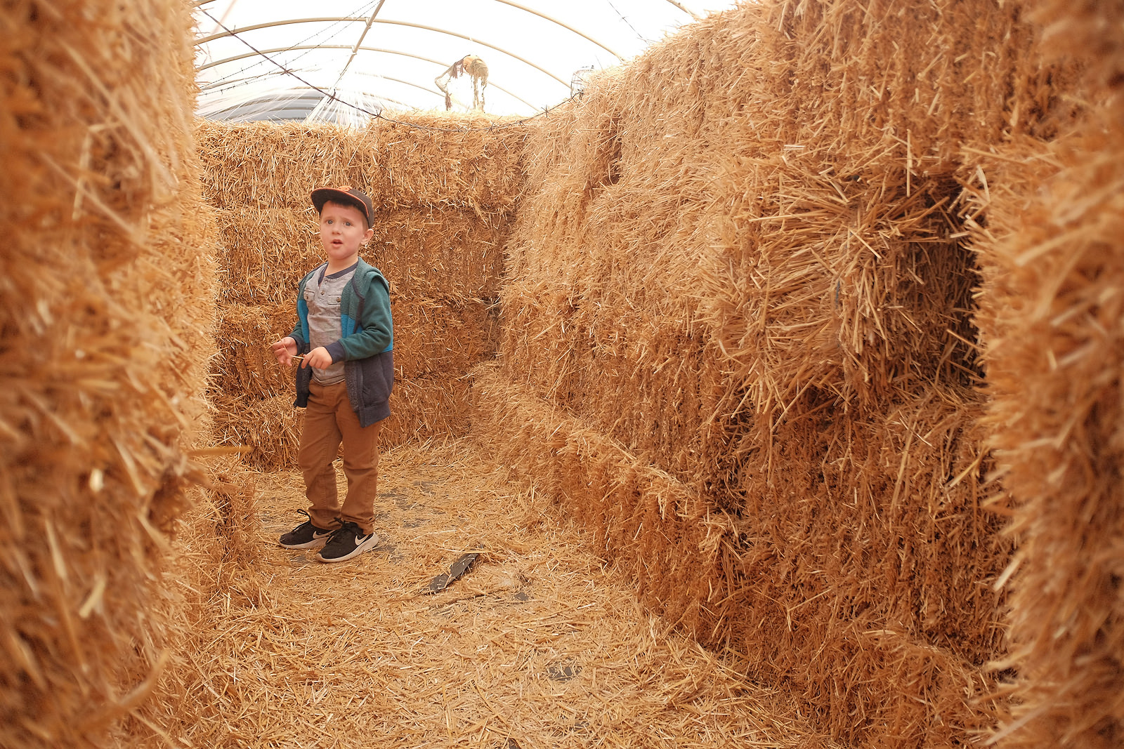
In the next example you see Charlie standing in the middle of some hay. But by taking a step back you can see he’s in a maze by the stacked hay walls and his confusion only adds to the interest because it tells more of the story.
Advanced
Once you start getting the hang of adding more content you should be ready for the advanced course on the rule of thirds. Creating your own. Sometimes placing your subject in the intersecting lines is not interesting enough. Stepping back to add more context adds a bit more but the photo is still lacking something. This is where simply waiting for the right moment comes into play. Waiting for the right moment for movement or your subject to do something interesting is creating your own photo that is not reactionary but it's being proactive. In my example below. Parker was drawing in her book intently and it was adorable so I wanted to take a photo but it just was not coming together. I had to either get high enough to see that it was a coloring book and lose her face or get low enough to see her face but lose the fact that she was coloring. This is where patience comes in. I found a low composition I like. I waited until she was done with the current page and went to flip to the next to snap the photo. The added context that she is coloring really makes this photo a joy to look at as it tells the whole story.
The next photo may be looked at as Framing but stick with me. I placed Charlie getting a haircut in the lower left but I found the flag separator things distracting even though I thought they would add simplicity. So I looked around to see how I could add more of the hair station to the photo, and I couldn’t without losing Charlies face. That’s when I saw the mirror, placed it in the lower right and snapped the photo. Now, this is not a great photo. I’m too far away to get the full effect of the reflection but the point is to show you to look around for what else you can add to the photo.
2: Framing
You can make any photo more compelling by using the rule of thirds as it requires nothing more than a camera and a subject. Framing your subject is the next step as it requires something extra. A frame! What can you use for a frame? As you’ll see in the examples below, you can turn just about anything into a frame! A frame is used to draw your attention to your subject. Sometimes isolating them in the frame, other times highlighting them. The point here is to make your subject stand out! I find when I see a frame, I love to turn the photo into a portrait which for me often does not follow the rule of thirds. But hey rules are supposed to be broken right?
Getting started with framing, once again, can be pretty easy. In my first example below you can see Parker was waving goodbye to me. She was already framed in between the curtains but I placed the camera where the windows framed her in the center of the photo. Done.
Same with the next example. Charlie was jumping on the trampoline. I simply waited until he was in the center, I moved to where he would not be blocked by the safety poles and took the shot. There is nothing magical here, but simple framing to get you started.
Intermediate
You will quickly see that anything can be used as a frame. Taking kids to the park is my favorite. They get out a ton of energy and I get to stretch my creative muscles. You see Charlie coming up the tube. The inside of the tube is dark, but at the end of it is bright. Charlie's body creates a silhouette that frames him in the photo. That alone would be a beginner framing technique. Adding in Parker looking at him gives more context. It shows they are playing together and having fun. It shows that the photo is more than just me asking Charlie to go in the tube so I could frame him in a photo.
The next example is from Charlie’s birthday at Chuck e Cheese. The kid is always in awe of how many awesome, fun, and colorful games they have. When he walked up to this one, I knew from behind you would be able to tell how focused he was on the game, so I used the games symmetry to frame him in.
Advanced
Now we are getting it. It’s time to start experimenting with frames while adding more context. Here Charlie was at the top of the playground looking over the rest of the park. You can see the interesting curves of the structure, the simple colors that are not too distracting, and the roof behind his head with lines that draw your eyes right to his. Like I mentioned earlier, this is more of a portrait because it would not hold the same weight if I moved him off to the left or right to incorporate the rule of thirds. BUT you will see that his head is on the top line, and his feet are on the bottom line. So while they are not intersecting, Im still aware of the Rule of Thirds.
In this photo, you can see Charlie throwing packing peanuts all over the kitchen having the time of his life. This photo was a tough one to take because as you can see the cabinet to the left really blocks off most of the action. But I used that empty space to frame Parkers head in there. Again adding more context. Try to look at this photo and imagine Parker was not in it. The photo would be incredibly boring because I would be too far away for the action. It would not be compelling. I’m not saying this photo is extremely compelling but adding Parker in the foreground looking at her brother turns this photo from a dud to a keeper because it adds to the story.
3: Leading Lines
Leading lines are something in the frame that can bring attention to your subject. Think of someone standing in the middle of a road that vanishes off into the sunset. Leading lines can be super subtle or very pronounced. It’s a way once again to draw your eyes right to your subject. Leading lines is the last step because it can be the most difficult. Your eyes do not naturally see leading lines. You brain does but continuously you don’t even notice them. You need to train your eyes to see them and capturing them almost ALWAYS means moving the camera to a place you didn't think of. Either higher or lower to perfect the angle or closer or further to make the lines more or less pronounced.
Beginner
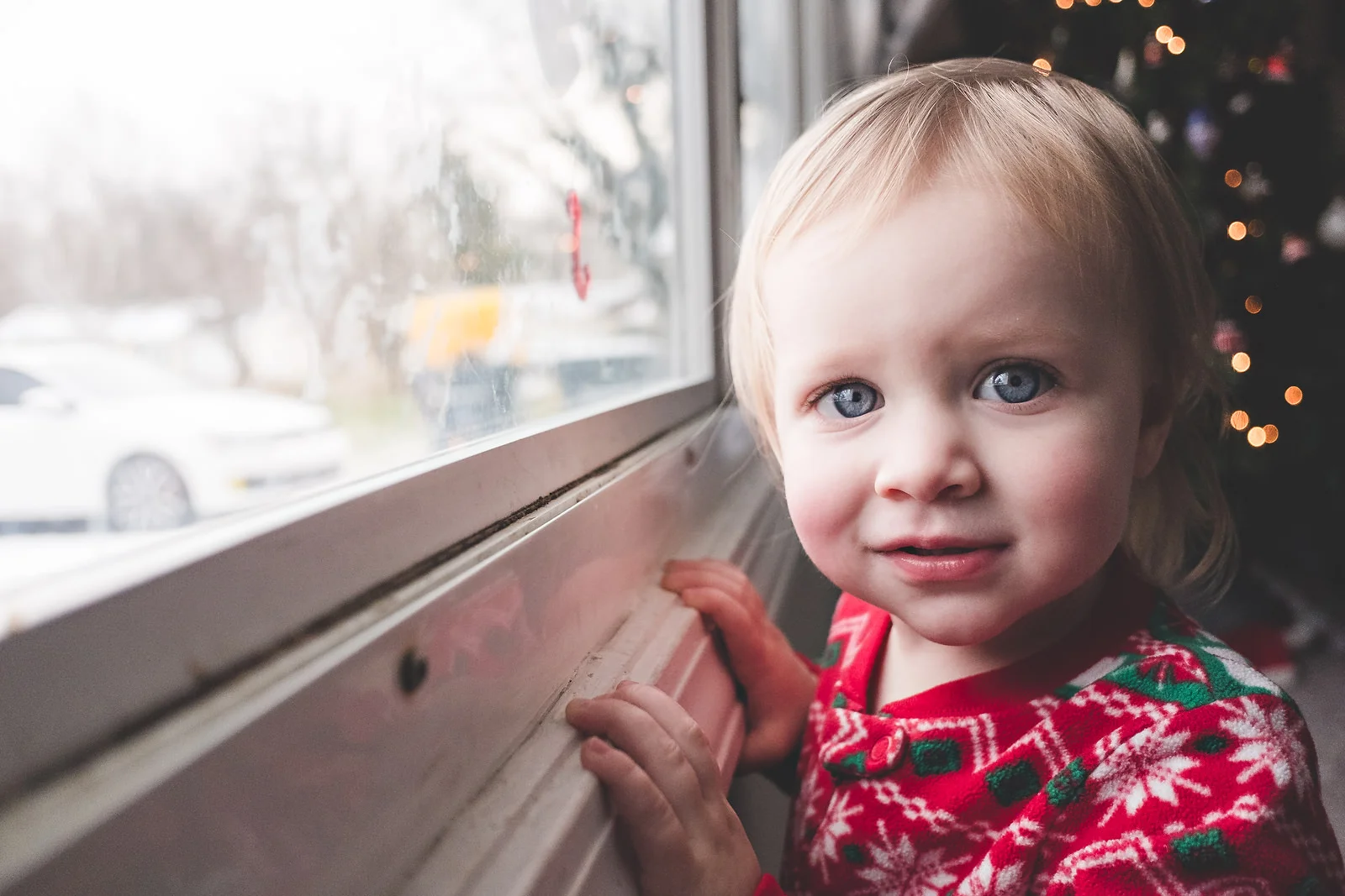
In this photo, you see Parker looking at the camera, but the window frame starts from the corner and goes right to her eyes. I moved the camera right next to the window to make the line more pronounced and then brought the camera down so that the line went right to her eyes.
Here you see Charlie dressed up for Halloween and the sidewalk is creating the leading lines that go directly to his head. To grab this shot I had to get the camera down to his level once again otherwise the sidewalk lines would have gone to his hips and that’s not interesting. Then I just framed him in the middle to maximize the effect of the lines.
Intermediate
Ok the basics are covered. Now is where you start experimenting once again to get unique lines and start to incorporate the other compositional tools. Here you see Parker was sitting on a ramp. By simply lowering the camera to the ground, the ramp created the leading lines that went right to her. Then I also placed her so that she was being framed by the tube behind her. This photo could have also worked with the rule of thirds. Mainly because of the frame behind. If she was not framed, I'm not sure it would be as compelling. That’s why this is more intermediate.
Once you start using leading lines you will see them everywhere. This is a great example. How many times have you been to the store and not recognized the shelves as leading lines? By just moving your camera up or down you can place the lines where you want. I wanted them to go to Charlie’s head since that’s where the action is. I found it and I snapped it. Here I am also incorporating the rule of thirds. Charlie is in the Top right of the corner, the phone is in the bottom left and the shelf draws you attention from one side to the other.
Advanced
The advanced lesson on leading lines is looking for things that are not lines to turn into lines. Starting off with something simple, you see Parker pointing to an ornament that we would not let her play with. Getting on her level here ads to the story. Getting close to the ornament, effectively making it larger in the frame adds to the story as well. The photo starts with us looking at parkers sad face. We want to know why she’s sad. We follow her arm that I waited for her to reach out pointing right to the ornament. Suddenly we get it.
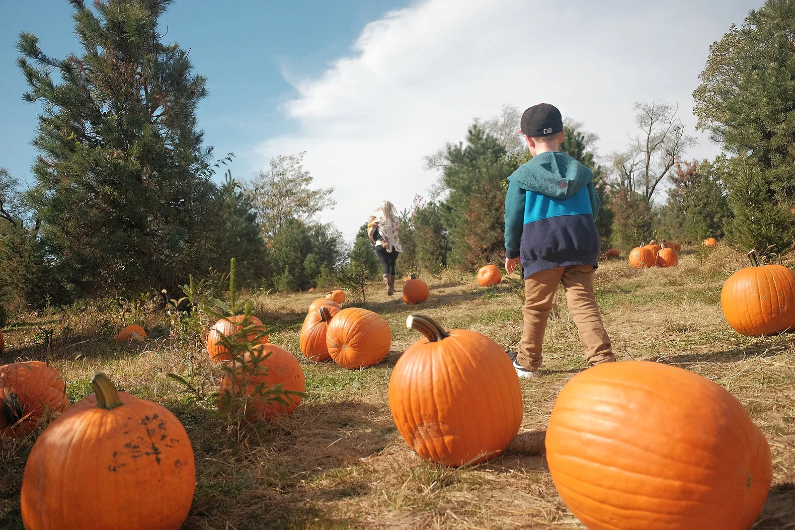
Next, again this photo is not particularly good but it’s to highlight a point. These pumpkins are round. They are balls. The furthest thing from a straight line. But by getting the camera low enough I have created a line that your eye can see. With Charlie in the right of the frame, and the line moving up and to the left we now see mom and Parker further down the trail. Don’t be afraid to move your camera around to find something unique.
The TRIFECTA!
We have made it. You have learned how the Rule of Thirds can make your photos more pleasing without any additional outside influence. You have learned how framing your subject makes them stand out in a sea of business. And you have seen how leading lines can add interest and weight to your photos. Now is the time we bring it all together. The more compositional tools you bring together in one photo the more powerful it becomes. So what does it look like when you have all 3 combined into one photo? NOTE: just because a photo has all three compositional tools, does not make it a perfect photo as you will see below.
Sometimes you get a “Happy accident” This was shot with a GoPro. I was not paying attention to the screen. I simply had the camera in burst mode, held it down at Parkers level and snapped away. Here you can see the water creates a leading line and is framing here in. On top of that, the sun is also directly behind her creating another frame with her on the right side of the frame loosely in the rule of thirds.
This was another photo I just snapped and it was not until later that I dissected it and saw it included all 3 elements. Charlie is in the lower left third framed by the fence and the water behind it. His arms are leading up to the raft elevator in the top right of the frame. Is this photo a show stopper? No, but its compelling enough to figure out the story of Charlie waiting for a raft to get into for his turn on the slide.
Here we have Parker, on the lower right of the frame being framed into the shadow of the couch with the pillows creating leading lines right to her eyes. The whole story is not here. She was sick and falling asleep on the couch and I was trying to capture that and I couldn't really. I tried, I added all three elements and still the photo falls flat.
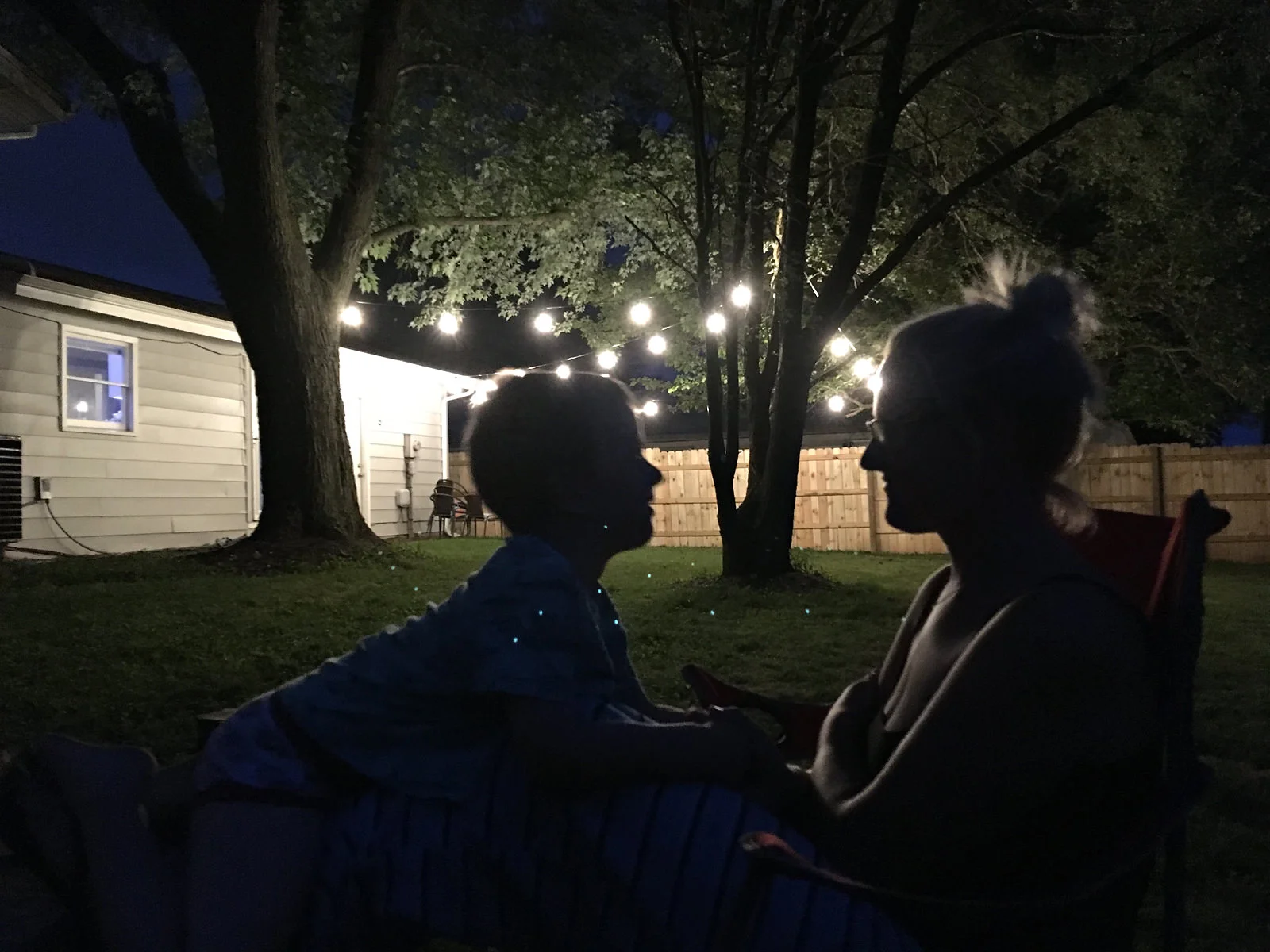
I love this one. It’s my wife and son Charlie talking about how much fun we had that daw while enjoying the warm summer evening. My wife in on the right third, Charlie is more towards the middle but it doesn't bother me. Their silhouettes are framed by the lit fence in the background which is also creating a bond between them with them lines of the fence.
If this isn't interesting I don't know what is. This show was much more intentional than the previous. Here is Parker in the lower left of the frame, being framed in by the door, looking outside waving at mom arriving home in the driveway. With the lines of the window and the front step outside leading to Parker. This tells a full story.
This photo was also intentional. Charlie is framed on the right side of the frame by the carpet in the background with leading lines of the shelves taking you right to his eyes. I could have got lower to get more emotion and framed his head into the tiled path but uh…. You live and learn. I'm not perfect.
This has to be one of my favorite photos I took last year. I think it’s just about perfect. I don't even think it needs an explanation. But if I could go back and do it again, I would try to move the camera more to the right to frame out the closet door their in the center.
Wrap Up
I want you to walk away from this feeling inspired. I had to go through a year's worth of photos to find these 25. And even then some are still not great photos despite using the compositional tools. Why should that inspire you? Well because it means that there is a whole world of photography out there to explore and master. Even after 10+ years shooting, I still work on my craft every day. Maybe next year I will take 27 photos I would be happy to show off as examples. It takes time and patience but you are clearly taking the right steps to better yourself and grow your skills as a photographer.
The 5 Photos You Need To Tell Any Story
Photography is a wonderful tool for storytelling. In photojournalism, you aim to tell an entire story in 1 frame so it can go on the cover of the Sunday paper. This is an excellent goal to strive for. I often see photographers new in their journey not giving enough context. It’s cool that you took a photo of someone with a sword but… why do they have the sword? Is it a performance? If so where is it? Is it just a costume? Or is there a man who thinks he’s a ninja and is terrifying people on the street? All of those instances bring up a completely different response on the viewers part.
Sometimes telling the whole story in a single frame is tough though! This is where a photo essay opens a whole world of possibilities. But just like a traditional essay, there are a few things you need to cover in order for it to still be interesting and compelling. Today we are going to go over the 5 photos you need to take for any photo essay.
1: The Establishing Shot.
This is the shot in movies from the outside of a house where the characters are inside plotting a bank heist, or the shot inside of a busy dimly lit restaurant where a couple are having their first date.This shot is important to give you context of where the action is taking place. For you this may be a wide shot of your kitchen with your child on a stool in front of a mixing bowl. It lets the viewer know where the action is happening and gives them a taste of what’s about to happen.
2: The Medium Shot.
Now that we know where the action is happening with the establishing shot, the medium shot gets closer to tell us WHO is participating in the action. This could be a waist up photo of your child with spoon in hand mixing away or adding in the chocolate chips into the cookie dough. On top of showing off who is participating in the action try and show off more of the action itself.
3: The Close Up
Ahhhh the infamous close up. This is the shot that can make or break the entire photo essay. We as humans are trained to look at and read other humans reactions. When someone is sad, you know they are sad. When someone is happy, you know they are happy. When someone is screaming with labor pains we feel sympathy. The close up gives our brains the info it needs to make a decision on how we should be feeling about the situation. So get close and pay attention to your backgrounds. Make sure the eyes go right to your subject and not to the mess in the background. Don’t be afraid to wait for the right moment. The look of anticipation for the cookies baking while illuminated by the glow from the oven light while looking through the glass. This shot should take you the most amount of time to capture.
4: The EXTREME Close Up.
I find this best used for details. Flour that spilled over into a tiny pile when your child missed the measuring cup. The dough on your child's fingers that they can’t wait to lick off. The measuring cup filled to the brim with milk or knife next to the stick of butter. These photos may not tell the whole story but the context they provide will be the icing on the cake (and no one likes un-iced cakes).
5: The Pay Off.
This shot is not always self explanatory as it does not dictate where the camera should be placed. Personally I like mine a bit wider than a close up. Sometime this is the reaction to the first bite of the cookie, other times this is a shot of just the cookie on the counter with a single bite taken out of it. Sometimes this is a photo of the freshly swaddled newborn baby, other times it is photo of the babies info of height, weight, name, etc with the family in the background. The pay off can be left up to interpretation and I love that.
What I love so much about this list is that no matter your skill level it gives you something to shoot for. Often when starting out, you can get so overwhelmed about what to shoot that you can take a million photos and still feel like a story is not being told. But if you try diligently to capture these 5 photos you will be sure to grow your skills of storytelling through your photography.
Want More Photography Tips to Grow Your Skills?
Shooting Manual in 3 Easy Steps
You got a nice camera and you’re ready to see what it can do! You put your camera in Auto mode and are quickly unimpressed with the results. You know the camera can produce great photos, you just need to learn how to get the camera to do what you want!
Read more


